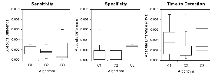
Comparison of the CDC and BioSTORM results for selected data sets
The plots display the absolute differences between the sensitivity, specificity and time to detection (TTD) values computed in the original CDC study and those obtained in our validation study using BioSTORM. The boxes display median, upper and lower quartile differences for each of the algorithms across selected data sets. Minimal and maximal differences are shown by whiskers, and the outliers – by circles.
← Back to Experiments
Except where otherwise noted, content on this wiki is licensed under the following license: CC Attribution-Noncommercial-Share Alike 4.0 International
